NHS Proxy Access
NHS App programme that allows birth mothers better control of their child’s healthcare.
Problem
Parents struggle to access their children's healthcare records due to unclear processes, safeguarding complexities, and lack of support, causing frustration and delays in managing essential health tasks.
Solution
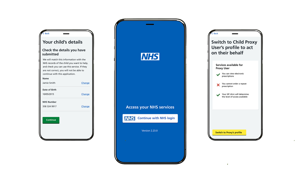
The NHS Proxy Access service provides a secure, step-by-step application process with clear safeguarding guidance, real-time feedback, and seamless access to manage children’s healthcare records, ensuring an efficient and user-friendly experience.
My Role
Full time Lead UX Designer. Conducting elements of Design Strategy, User Research and Prototyping. Working closely with NHS App team stakeholders, and project managers to ensure smooth implementation and alignment with NHS requirements.
Scope
4 month client project
View Gallery
Design Approach
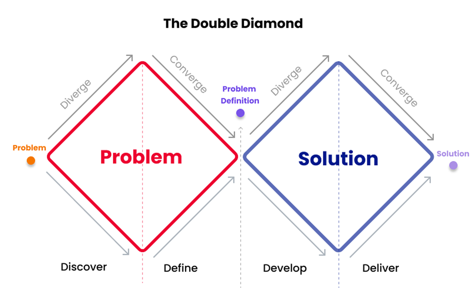
The design process for the NHS proxy Access project was structured using the Double Diamond Framework, ensuring a user-centred approach while iteratively refining solution.
1. Discover Phase (Identify the Problem)
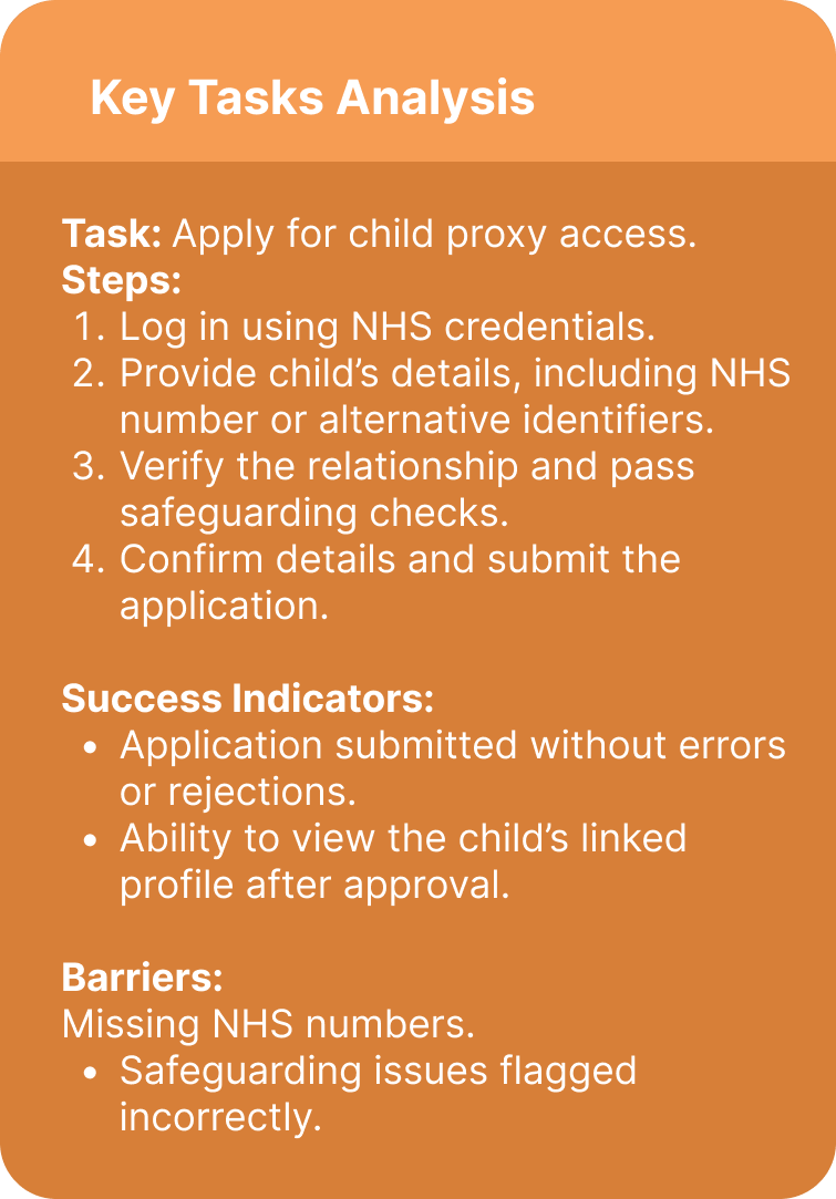
User Interviews: Together with UR on the team I have conducted interviews with parents to identify pain points in the existing proxy access process. Key findings included:
Difficulty in navigating NHS systems to request proxy access.
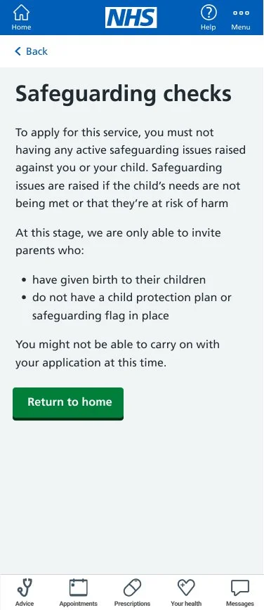
Anxiety over safeguarding checks and unclear rejection reasons.
Desire for a seamless process to access child profiles and manage prescriptions.
Secondary Research: Studied NHS guidelines on proxy access and safeguarding requirements. This revealed:
Complex eligibility criteria for proxy relationships.
Technical and legal challenges in data privacy and safeguarding checks.
Personas: Created user personas like Emily (a tech-savvy mother of two) to guide design decisions and ensure solutions address user-specific needs.
The outputs were:
User Personas
Problem Statements: How might we streamline the proxy access process for parents while maintaining security and safeguarding standards?
2. Define Phase (Framing the Problem)
Objective: Synthesize insights and clearly define the problem to focus design efforts.
Problem Clustering: Grouped issues into categories: application challenges, safeguarding concerns, and usability barriers.
User Journey Mapping: Mapped the end-to-end process parents follow to apply for proxy access, identifying bottlenecks such as: Lack of clarity on GP approval processes.
Design Challenge:
How might we create a secure, intuitive, and inclusive interface that guides parents through the proxy setup process while meeting NHS safeguarding standards?
Outputs:
Refined User Journey Map
3. Develop Phase (Ideation and Prototyping)
Objective: Brainstorm solutions, create prototypes, and test them with users.
Brainstorming: Held ideation workshops to explore potential solutions, such as:
Step-by-step guidance for proxy applications. (for which the agreement was to produce a small information leaflet to be present in GP surgeries)
Dynamic error messages to address incomplete forms. (pending NHS guideline approval)
Visual confirmation of safeguarding steps for user reassurance.
Wireframes and Low-Fidelity Prototypes: Designed and tested wireframes with users to validate: Navigation flows.
Placement of key features (e.g., child profile access). This also needed verification with the NHS App development team
Iteration: Based on feedback, iterated on designs to improve clarity and reduce user friction.
Outputs:
Low-fidelity Wireframes
User Feedback Synthesis
4. Deliver Phase (Final Design and Handoff to BETA Stage pending successful Alpha Stage Assessment)
Objective: Finalize the design and prepare it for implementation.
High-Fidelity Designs: Delivered polished UI designs featuring:
A clean, NHS-compliant component scheme and content design aligned with NHS guidelines and policies.
Collaboration: Collaborated with other Proxy teams across NHS to ensure consistency and cross functionality and hand off for BETA stage teams.
Outputs:
High-Fidelity Prototypes
Design System for Handoff
Documentation
User flow
Using a quick white boarding tool, I was able to guide the team through the proposed user flow and ensure that key policy driven topics were clarified before commencing the design process.
I could then start rapid prototyping in Figma to outline the user flow and various user path possibilities.
In the beginning the discussion with the team involved the registration process. I needed to push against the idea of GP-led registrations and allow users to complete the entire journey on the app itself. This made it more transparent and resonated with early user interviews being conducted.
Working alongside the multi-disciplinary team on this project allowed for great collaboration. This was most evident when working with the Content Designer, who could guide me on many of the NHS content guidelines and NHS Policy and Clinical requirements.
To allow for better agile working, I shared my working space with the Content Designer which allowed direct input in the registration process, and quick iterations of questions and guidelines as the project evolved.
NHS Components & Prototyping
Using NHS components made high fidelity prototyping not only quick, but also allowed for agile UX working, such as putting together screens rapidly and changing iterative elements with ease.
In prototyping the service, I’ve used a quick low fidelity approach to draft up the storyline and guide my team through the suggested user flow. Once that was greenlit through PO and Content, I was able to smoothly transition into creating high fidelity wireframes.
This was an efficient approach as it meant I could go through 2-3 iterations, with the team and UR feedback in the span of 2 weeks.
The challenge came from Service Design mapping and ensuring the riskiest assumption and ‘unhappy’ journeys are accounted for. This also meant journeys that will occur outside of the NHS App, as with rejection of the application on GP stage (once submitted through the app). How that’s communicated became a challenge.
Additionally, the MVP’s perceived value was low at launch by the users, due to limitations of NHS SPINE rollout, so it was important to work alongside other NHS Proxy programmes to ensure alignment and marketing of the service within its constrained functionality at launch.
Research Insights
There were a number of takeaways and insights from the user research which then influenced the shape of the final design.
Balancing the right amount and level of content information during application flow
Failure indicators and ‘unhappy’ journeys needed better signposting for more information (not feasible within the app)
Provide additional steps around safeguarding information collection
Further challenges were presented with regards to working within constraints around NHS app, such as details alignment between NHS records and child details, NHS login number and safeguarding disclosures, which were we not able to bypass on the service level. Instead I’ve opted to provide as much signposting for information sources within the journey (such as to GP clinics)
Product highlights
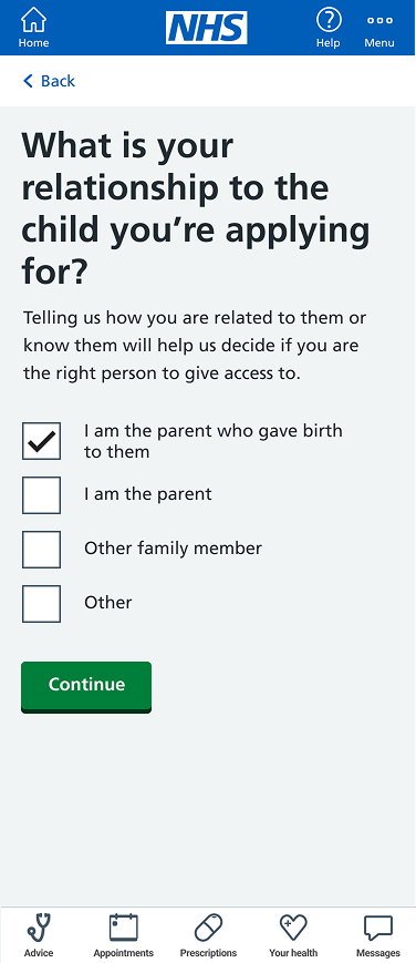
One question per page approach
The proxy application can be daunting and require specific conditions for the user to be successful.
To ensure the user is not overwhelmed, I’ve designed the questionnaire with a one question approach, meaning that at any time they don’t see more than a single question.
This also means that if they don’t meet the requirements early on, the form will provide immediate feedback to the user on why they are not able to progress further (without limiting them to re-apply)
Answer checkpoints
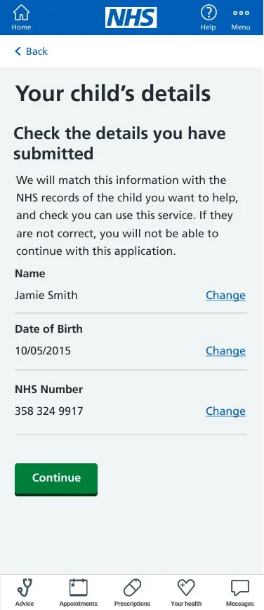
I have utilised response checkpoints which come up at the end of each section. This provides the user a chance to double check their answers and immediately turn to the given question if their response was not correct.
This was an important addition I’ve added following user feedback, as the form doesn’t allow for any error. The responses provided are checked against NHS records by an API. Failing those would disqualify the user, sometimes without notifying them why.
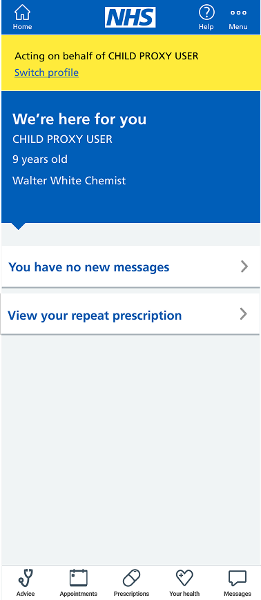
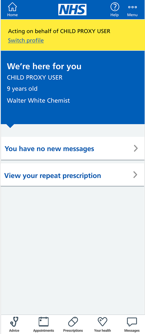
Proxy user notification
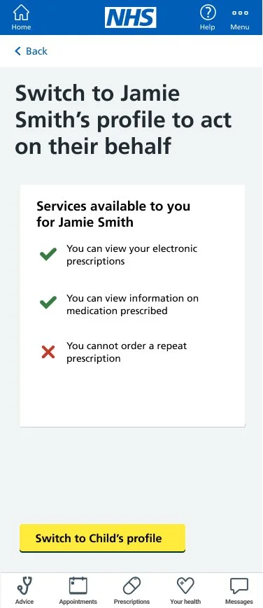
Working together with the other Proxy Access teams across NHS Digital, we’ve collaborated how to best represent and notify uses if they’re accessing a proxy’s account (as opposed to their own). This took some testing for accessibility and trying out various components before landing on the desired look that worked well with users.

